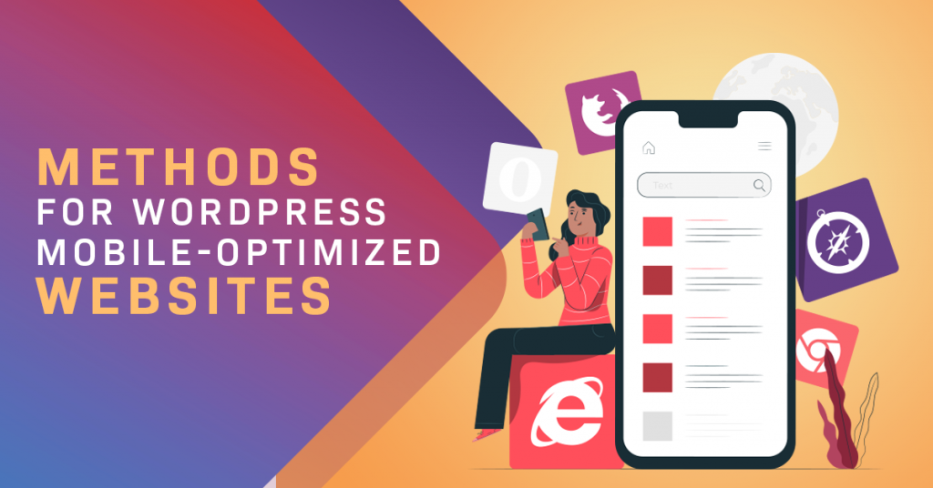
Having mobile-optimized websites is no longer a matter of luxury but a necessity for business owners. If you want your website to be relevant to your target audience, then you need to give them easier access through their various devices. Read on as we discuss to you some of the ways on how you can optimize your WordPress website for mobile use.

How to Build Mobile-Optimized Websites
To begin, here are five easy methods from a WordPress web development company that can guide you on optimizing your WordPress website to mobile devices.
1. Choose a Responsive WordPress Theme
One of the most commonly-used methods to make mobile-friendly websites is through the use of responsive web design. It creates websites that quickly adapt to the different screen sizes of various devices, including desktop computers, laptops, tablets, and mobile phones, without compromising usability and user experience.
With a responsive WordPress theme, your site can automatically adjust its appearance according to the devices used by viewers, without CSS changes or any code additions. You can find many well-designed responsive themes in the WordPress marketplaces today. Theme Forest, for instance, offers thousands of responsive WordPress themes. Other markets also include Elegant Themes and Mojo Themes. With thousands of responsive WordPress themes, you can indeed find one that suits your requirements.
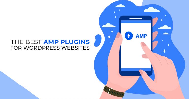
2. Employ a Mobile Plugin
Besides using a suitable and responsive theme for your WordPress website, you can also employ mobile plugins to create a mobile-friendly website. Without going through complicated procedures, you can easily install and configure WordPress plugins for your business website to optimize it for mobile use.
Today, WordPress developers are provided access to thousands of WordPress mobile plugins to create mobile-optimized websites. Here are some of the top WordPress mobile plugins that can make your job much more comfortable and more streamlined:
- WPTouch. A mobile plugin that automatically enables a mobile-version of your site and adds a simple yet elegant mobile theme for website visitors using mobile devices.
- Amp for WP. This is a mobile plugin that automatically adds Accelerated Mobile Pages (AMP) functionality to your WordPress website. AMP accelerates your page load speed for mobile users.
- Jetpack. Another mobile plugin that leverages the power of AMP to optimize websites for mobile users. It also optimizes your images with its free content delivery network (CDN).
- WordPress Mobile Pack. A WordPress mobile plugin that transforms your website’s content into a mobile web application, which comes with various mobile app themes for you to purchase individually or as a bundle.
- WP Mobile Menu. It is one of the best mobile plugins to create a responsive mobile menu for your website. The plugin gives your mobile visitor easy access to your site’s content, no matter the mobile device that they use.
3. Create a Mobile Version
Another method for making a mobile-optimized website is by creating a mobile version of your website. It may require more work from you compared to the previous methods. However, employing this method allows you to only display particular features of your site to your mobile users.
Therefore, if you choose to go with this method, remember that you must keep your web design consistent between its desktop and mobile versions. You can do this by employing a mobile theme for your website.
4. Reduce Elaborate Graphics
Placing too many graphics on your website will increase the time for a page to load fully. Your site visitors, especially those viewing through their mobile devices, will find this annoying and a waste of their time. Shoppers in eCommerce sites hate to go through various images and other graphics to find what they are looking for. They only want to see the product that they want and make a purchase in the shortest time possible.
As part of your strategy to make eCommerce product pages that sell, you must know how much graphics to place on your site to have it optimized for mobile use. So, try to keep your WordPress website simple and straightforward.
5. Choose Text Wisely
Finally, apart from using a considerable number of graphics, you also have to place enough text on your web pages. As such, compared to desktop computers and laptops, mobile devices such as smartphones have a more limited space on their screens for users to see in one glance what your content is all about.
Thus, you can employ above the fold web design to ensure that your site visitors immediately understand what your business is all about without zooming in and out or scrolling up and down. Lastly, keep your paragraphs and other descriptive texts short and direct to the point.
Make Mobile-Optimized Websites with WPD
With new mobile devices built and released every day, the future of business websites rely on its mobile design. So, if you haven’t optimized your site for mobile users yet, then right now is the perfect time for you to do so. Employ a WordPress developer in the Philippines to get the job done for you!
Do you know of any other methods that we can utilize to build mobile-optimized websites for WordPress? Let us know by leaving a comment below!